
Phone & tablet layout
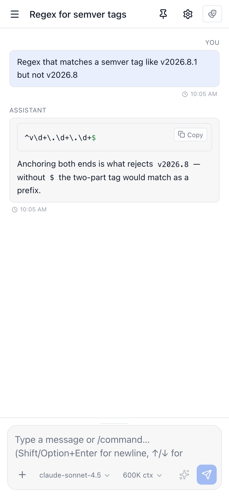
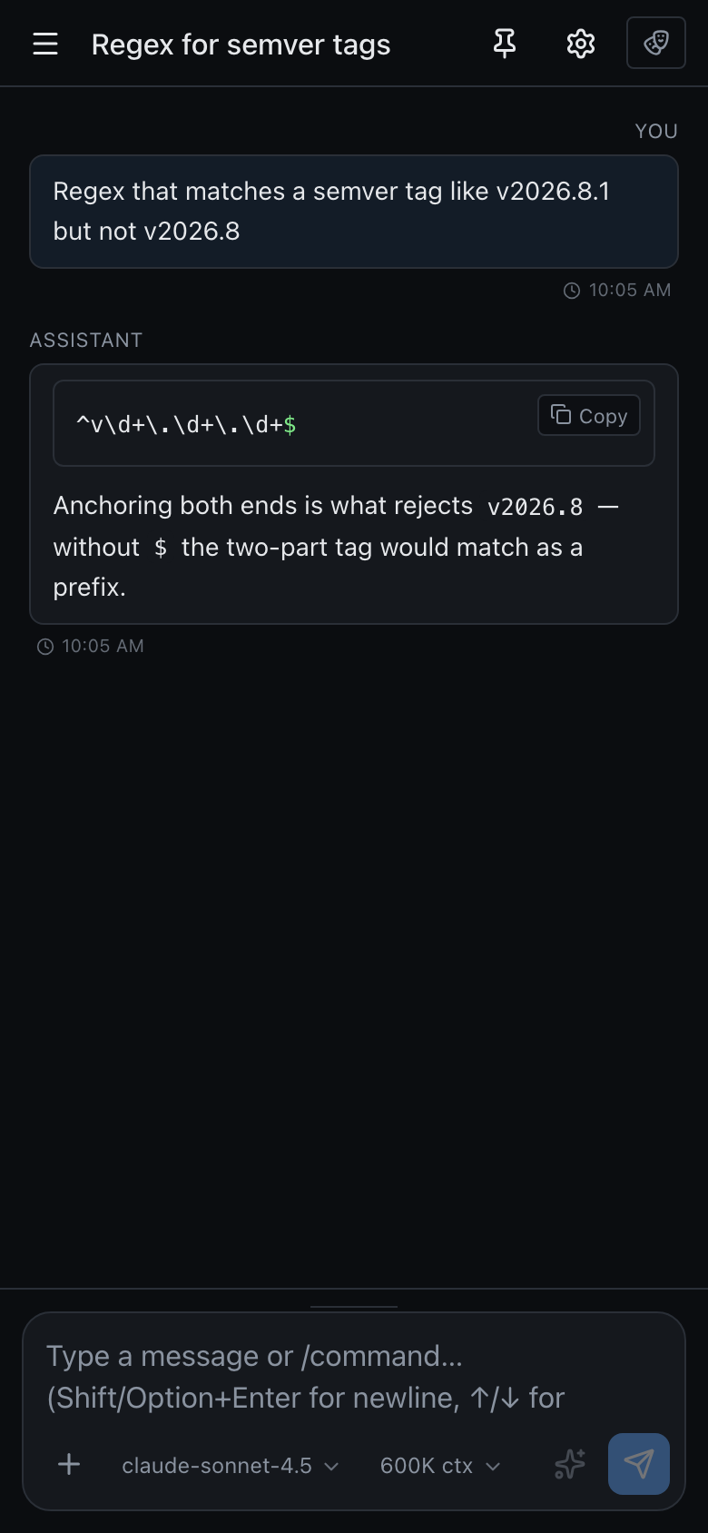
Precursor's shell was built around a permanent sidebar sitting next to the content. That works from a laptop upwards, but on a phone the sidebar alone claimed most of the screen — leaving a sliver for the conversation and making the app effectively unusable. Below 768px the shell now switches to a single-pane layout: the main surface gets the whole width, and navigation moves into a drawer you pull out when you need it.
Nothing changes above that width. The resizable sidebar, its rail/tabs switcher, and every side panel behave exactly as before on a desktop.
The navigation drawer
The shared header grows a hamburger on narrow screens. Tapping it slides the sidebar in over the content, dimming what's behind it; tapping the scrim, the ×, or pressing Esc puts it away. The drawer is the same sidebar you get on a desktop — section rail, collections, search, the item list and the persona footer — so nothing is hidden from you, it just isn't taking up room when you aren't using it.
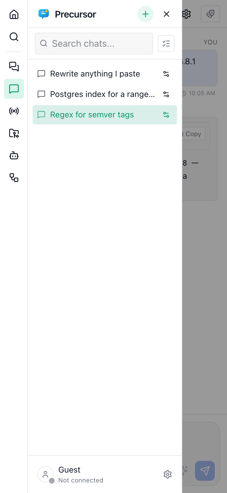
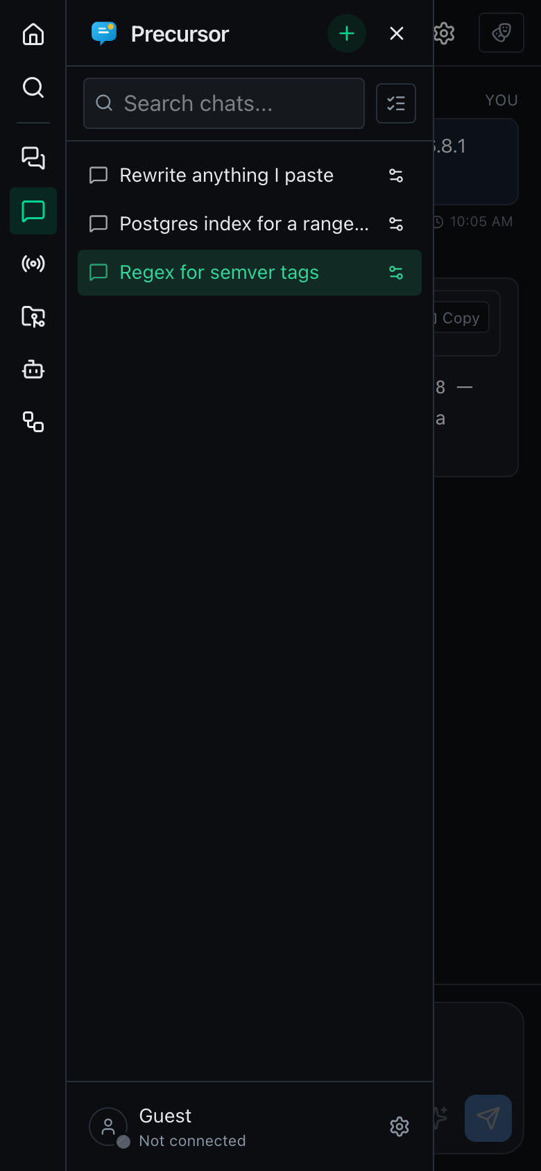
It closes itself the moment you pick something — a topic, chat, session, workspace or the home launcher — so you land straight on the content instead of having to dismiss it. Switching section leaves it open, because you'll usually want to choose from that section's list next. The two sections whose list lives in the main pane rather than the sidebar (Agents and Workflows) close it too, since there'd be nothing left to browse.
On the home launcher, the drawer replaces the standalone section rail entirely, so there's exactly one navigation affordance to learn.
Panels that can't fit
A few surfaces are two or three panes side by side. Rather than squeeze them, they collapse to one pane on a phone:
| Surface | On a phone |
|---|---|
| Workspaces | The file tree and the editor become a list → detail flow — the tree owns the screen until you open a file, and a back arrow returns to it. |
| Workspace assistant | Opens over the workspace instead of beside it, and starts stowed in its rail so it isn't what you land on. |
| Conversation stats | Hidden. It's an at-a-glance diagnostic, and even collapsed its rail cost width the transcript needed. |
The workspace assistant uses its own, wider threshold — 1024px — because a file tree, an editor and a 24rem assistant leave the editor unusable long before the phone breakpoint. On a tablet the tree and editor still sit side by side while the assistant overlays.
Your desktop preferences aren't overwritten by any of this — the assistant panel in particular deliberately doesn't persist a small screen's collapse state back over the one you set where it fits.
Touch details
Several things that are fine with a mouse are broken without one, and are fixed under (hover: none) — that is, on devices whose primary input can't hover, so a touchscreen laptop with a trackpad is unaffected:
- Hover-only actions stay visible. Row actions (chat settings, pin, reminder, file actions) and the Copy button on code blocks only appeared on hover, which on a touchscreen means never. They're now always shown when hovering isn't possible.
- No zoom-on-focus. Safari zooms the page in whenever you focus a control whose text is under 16px, and doesn't zoom back out. Inputs, textareas and selects get a 16px floor on touch devices, so tapping the composer no longer throws the layout sideways.
- Real viewport height. The shell is sized with
100dvhinstead of100vh, so the composer stays above the browser's collapsing address bar rather than underneath it. - Safe areas. The page is rendered with
viewport-fit=coverand the composer bars pad themselves past the home indicator on notched phones. - No rubber-banding. Panes scroll internally, so the page itself is pinned.
Installing it to the home screen
Precursor ships a web manifest and apple-touch icons, so Add to Home Screen gives you a standalone, chrome-less window that now has a layout to match. It's still the same local-first app: your phone has to be able to reach the machine Precursor runs on, which by default binds to localhost only — see configuration for changing the bind host.
Small screens are a layout, not a separate app
Everything is the same application and the same data. Surfaces built around wide, dense tables — the workflow builder canvas, for instance — remain more comfortable on a larger screen even though they no longer overflow.